
Hi All!
Kerry asked me to share a few pictures and talk about my Farmer's Wife Sampler
Here is a picture of my first Farmer's Wife Sampler as a quilt top.
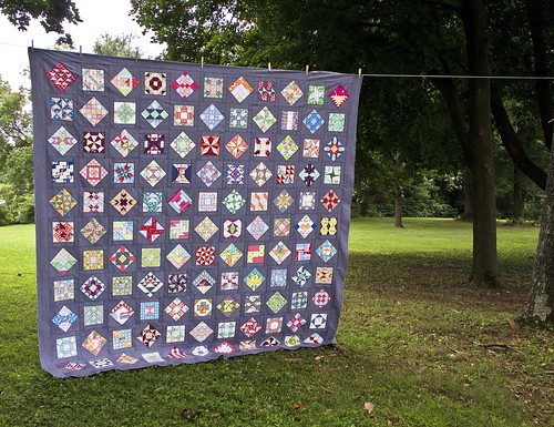
I had never made a sampler before and once I started, I was addicted. I love how each block is it's own challenge, how a single block feels like a finished project and how I never get bored making them.
For my first Farmer's Wife Sampler, I used my favorite fabrics in my stash (it has 354 different fabrics in it). When designing fabric combinations, I strived for color contrast, value contrast, different print scales and differing design styles. My theory is when I put all of the work into piecing these blocks, I want each little triangle and square to shine. I even went so far as to remake 14 blocks that looked muddy to my eye and I don't regret it a bit.
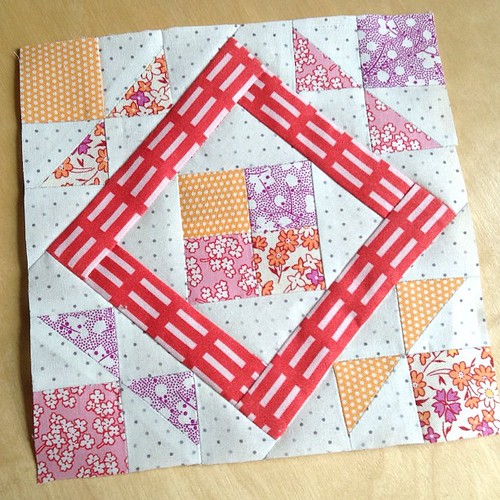
This block has 30's repros, low volume background and a bright, modern graphic print to make the square in the block stand out.
Here is a block with a Japanese sewing print paired with a crosshatch.
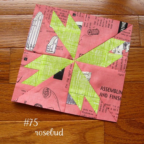
This block shows two florals but vastly different colors, tones and scales.
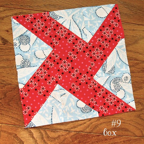
When I looked at my fabrics, I also chose the largest scale fabrics that I *had* to include and then looked through the blocks to match them up to the right pattern. This one combines a novelty print with a graphic print.

I'm hand quilting that sampler so I can enjoy each block all over again.

For my Farmer's Wife Pony Club Sampler, I decided to use all Anna Maria Horner fabrics plus solids. That has been an all new challenge since AMH uses a lot of bright colors, many florals, often large scale and very few low volume prints. Here is a picture of four of my blocks. I hope they show ways to achieve contrast in color, tone, scale and print style even with one designer's fabrics.

I don't know what my fabric theme will be for my Farmer's Wife 1930's sampler. I'm considering a focus on more modern graphic prints and stripes. What fabrics are you thinking of?

